American Packrafting Association
After 8 years of growth in the non-profit world fostering a community of engaged packrafters, American Packrafting Association sought a rebrand in 2020. The goal of the rebrand was to elevate their logo into a more contemporary look and feel while still holding true to APA’s commitment to conservation and adventure. We also wanted to represent their growth into a larger organisation.
For the primary logo we focused on the energy, freedom, and fluidity of the sport of packrafting. The colour palette draws inspiration from nature and elements of American culture.
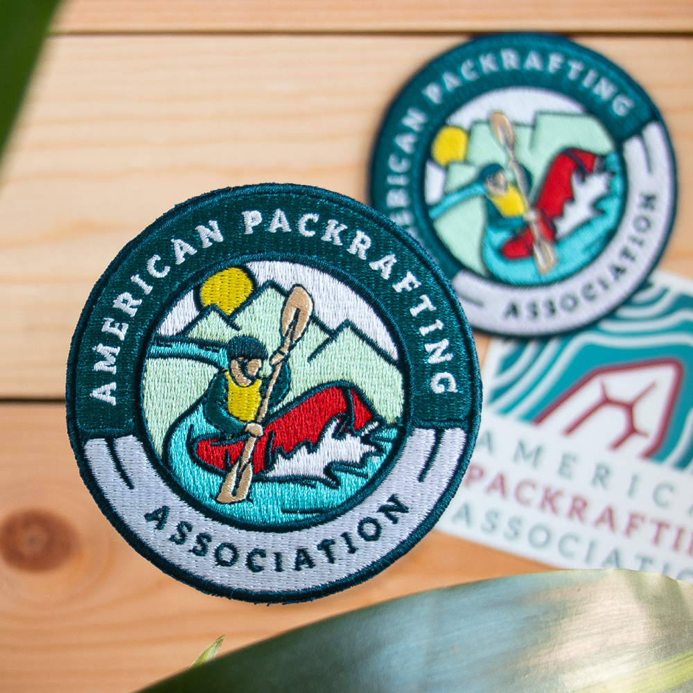
For their badge, we aimed to represent packrafting by highlighting its connection to both land and water, while also evoking the outdoor culture.
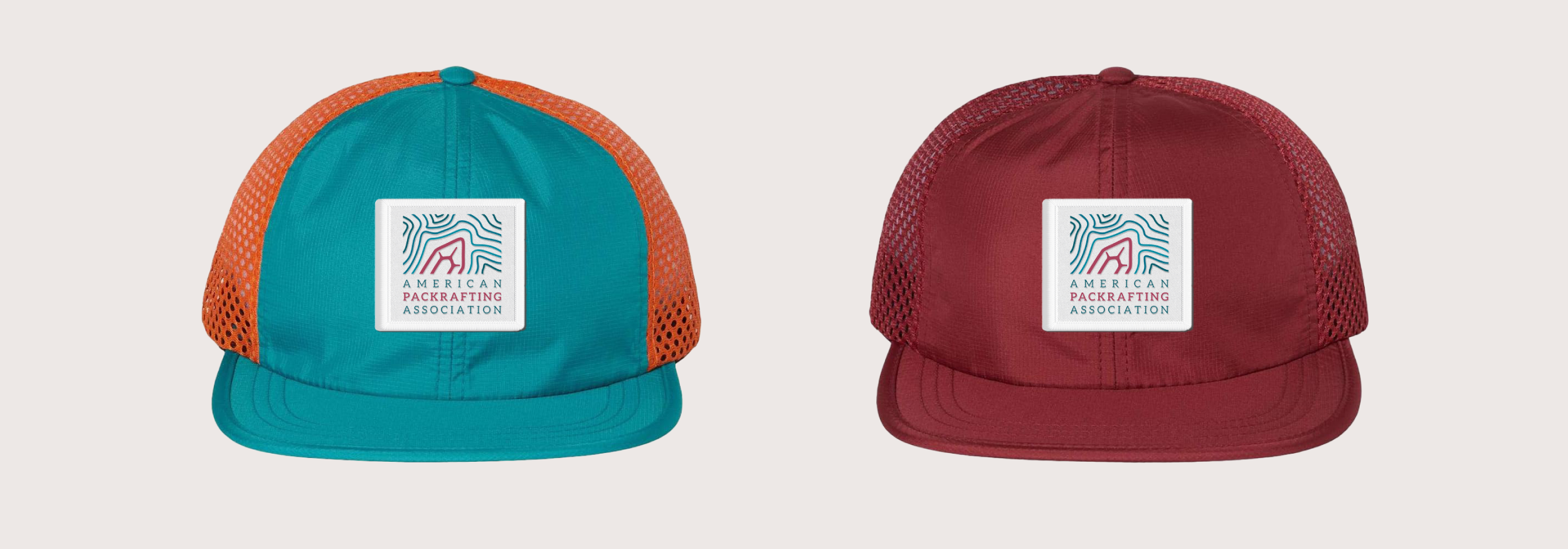
Hat merchandise photos courtesy of APA.
